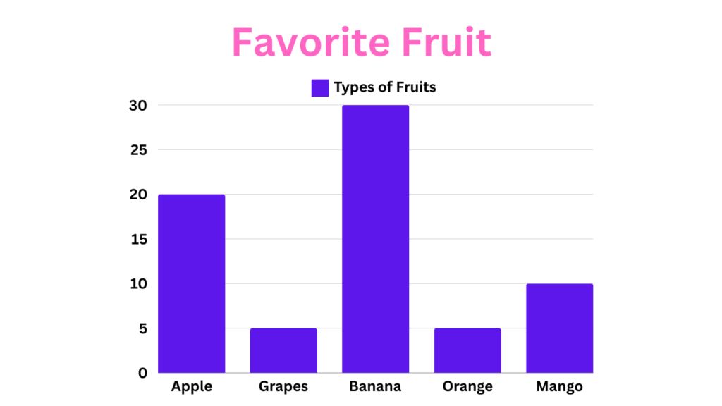
Have you ever looked at a bar graph and thought, “Wow, that makes everything so clear!”? Bar graphs are one of the most popular ways to present data visually because they are easy to understand and can effectively highlight trends and comparisons. If you’ve ever wondered how to make a bar graph that looks professional and communicates your data effectively, you’re in the right place. In this guide, we will walk you through the entire process of creating a bar graph, from collecting your data to presenting your finished chart.
What is a Bar Graph?
Before diving into how to make a bar graph, let’s define what a bar graph is. A bar graph, also known as a bar chart, is a visual representation of data using rectangular bars. Each bar represents a category of data, and the length or height of the bar corresponds to the value of that data category. Bar graphs can be oriented vertically or horizontally, depending on the data and the intended presentation.
Bar graphs have been around since the 18th century and were popularized by William Playfair, a Scottish engineer and political economist. They have since become a staple in data visualization due to their simplicity and effectiveness in comparing different sets of data.

Benefits of Using Bar Graphs
Learning how to make a bar graph is incredibly beneficial for several reasons:
- Easy to Understand:
Unlike some more complex chart types, bar graphs are incredibly user-friendly. They allow viewers to grasp comparisons between different categories at a quick glance. This makes them perfect for presenting information to a broad audience, regardless of their data analysis experience. Imagine showing a bar graph of student test scores to a group of parents – everyone will be able to understand which subjects students performed best or worst in, based on the height of the bars. So, learning how to make a bar graph is an essential skill to possess.
- Effective for Comparison:
Bar graphs truly shine when it comes to showcasing how different categories stack up against each other. Imagine a bar graph comparing the average price of different types of cars (sedans, SUVs, trucks) – it instantly reveals which category has the most budget-friendly (or most expensive) options.
- Versatile Use Cases:
Bar graphs are incredibly versatile and can handle various data types. Numbers, percentages, and even frequencies can all be effectively visualized using bar graphs. This makes them a widely applicable tool for data visualization across various fields.
Components of a Bar Graph
Understanding the components of a bar graph is essential when learning how to make a bar graph. Here are the key elements:
- X-Axis (Horizontal Axis): Represents the categories of data.
- Y-Axis (Vertical Axis): Represents the values of the data categories.
- Bars: Rectangular shapes representing the data for each category.
- Labels: Text indicating what each axis and bar represent.
- Legends: Optional elements that help explain the data categories, especially useful in complex bar graphs.
- Color Schemes: Different colors can be used to differentiate between bars, making the graph easier to read and more visually appealing.
Types of Bar Graphs
There are several types of bar graphs, and knowing which one to use is crucial when learning how to make a bar graph:
- Vertical Bar Graphs: The most common type, where bars run vertically.
- Horizontal Bar Graphs: Bars run horizontally, useful when category names are long.
- Stacked Bar Graphs: Bars are stacked on top of each other, showing the cumulative total.
- Grouped (Clustered) Bar Graphs: Multiple bars are grouped together to compare different sub-categories within each main category.
How to Make a Bar Graph: Step-by-Step Guide
Now that we have a solid understanding of bar graphs, let’s dive into how to make a bar graph with these seven simple steps.
Step 1: Collecting Data
The first step in how to make a bar graph is collecting and organizing your data. Your data should be relevant to the message you want to convey. Ensure the data is accurate and divided into categories that are easy to compare.
Step 2: Organize Your Data
Before transforming your data into a visually appealing bar graph, you need to ensure it’s organized clearly. This will make the process of how to make a bar graph much smoother. List your categories along one axis (usually the horizontal x-axis) and the corresponding values along the other axis (usually the vertical y-axis).
Here’s an example:
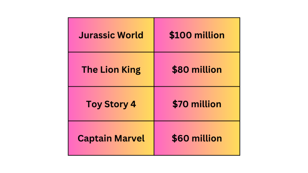
Imagine you have data on movie ticket sales for the following movies:

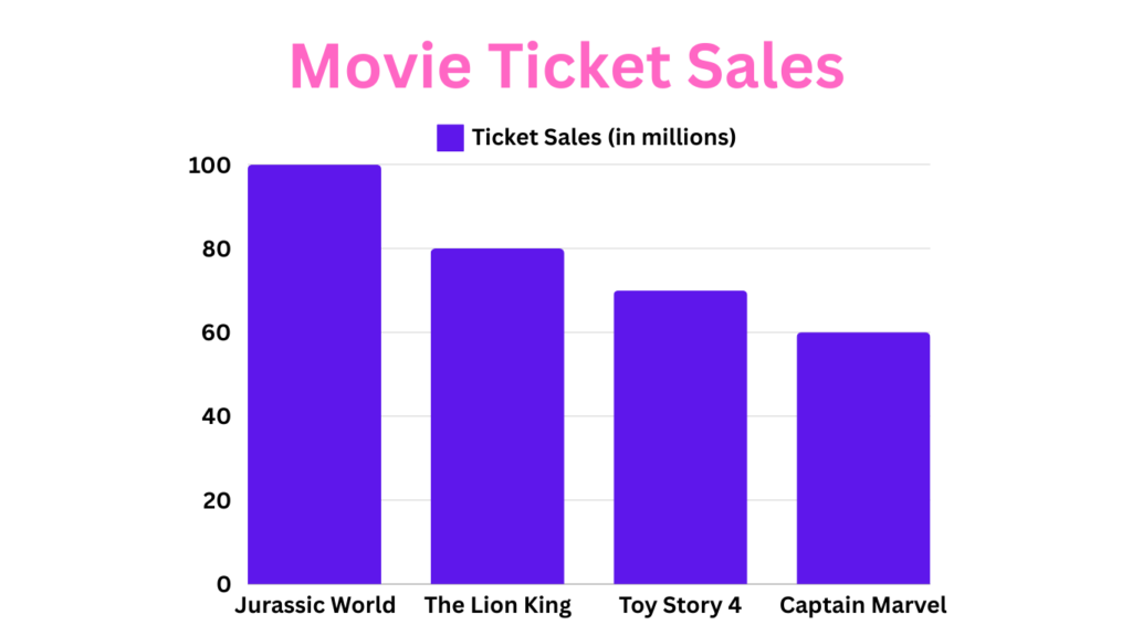
To make a bar graph, you would list the movie titles (categories) on the x-axis and the corresponding ticket sales (values) on the y-axis. This ensures that when you plot the bars, they accurately represent the sales figures for each movie.
Step 3: Choosing the Right Tool
There are many tools available for creating bar graphs. Here are some popular options:
- Microsoft Excel: A powerful tool with extensive charting capabilities.
- Google Sheets: A free, web-based alternative to Excel.
- Online Tools: Websites like Canva, ChartGo, and Plotly offer user-friendly interfaces for creating bar graphs.
- Specialized Software: Programs like Tableau and Adobe Illustrator provide advanced features for creating detailed and customized bar graphs.
Each tool has its strengths, so choose the one that best fits your needs and level of expertise.
Step 4: Creating the Bar Graph
Let’s walk through how to make a bar graph using a few popular tools:
Microsoft Excel:
- Enter your data into a spreadsheet.
- Highlight the data range.
- Go to the ‘Insert’ tab.
- Click on ‘Bar Chart’ and select the desired style.
- Customize the chart using the design and format tabs.
Google Sheets:
- Input your data into the cells.
- Highlight the data range.
- Click on ‘Insert’ in the menu.
- Choose ‘Chart’ and then select ‘Bar Chart.’
- Adjust the chart settings as needed.
Online Tools:
- Visit the website (e.g., Canva, ChartGo).
- Enter your data into the provided fields.
- Customize the chart’s appearance.
- Download or embed the chart as needed.
Step 5: Adding Labels and Legends
A crucial part of how to make a bar graph is adding labels and legends. Labels should clearly indicate what each axis and bar represent, ensuring your audience can understand the graph quickly. Legends are helpful in more complex graphs to explain the different data categories or series.
Step 6: Styling and Customizing
Customization can make your bar graph stand out. Here are some tips on how to make a bar graph more engaging:
- Colors: Use contrasting colors for different bars to enhance readability.
- Bar Width: Adjust the width of the bars to ensure they are neither too thin nor too thick.
- Gridlines: Adding or removing gridlines can make the graph easier to read.
- Fonts and Text: Use clear, legible fonts for labels and titles.
Step 7: Interpreting and Presenting Your Bar Graph
Creating a bar graph is just the beginning. Knowing how to make a bar graph also involves interpreting and presenting it effectively. When presenting your bar graph, explain what the data represents and highlight key insights. Ensure your audience understands the significance of the comparisons shown.
Here is the final result of how to make a bar graph:

Common Mistakes to Avoid
Here are some common mistakes to avoid when learning how to make a bar graph:
- Overcrowding with Data: Too many bars can make the graph hard to read. Simplify where possible.
- Using Similar Colors: Distinguish bars with different, contrasting colors to avoid confusion.
- Misleading Representation: Ensure that the data accurately represents the comparisons without distortion.
Bar Graph vs. Histogram
Understanding the difference between a bar graph and a histogram is crucial when learning how to make a bar graph. While both are used to represent data visually, they serve different purposes. Here’s a quick breakdown to help you differentiate between the two:
-
Data Type: Bar graphs are ideal for comparing categorical data. This means the data falls into distinct categories, like types of fruits (apple, banana, orange) or customer satisfaction ratings (excellent, good, fair, poor). Histograms, on the other hand, are designed to visualize continuous data. This refers to data that can take on any value within a specific range, such as the heights of students in a class or temperature readings throughout the day.
-
Bar Widths: In bar graphs, the bars have a fixed width and are spaced evenly apart. This emphasizes the comparison between categories. Histograms, however, utilize bars with variable widths. These widths represent the range of values within a specific category, allowing for a visual representation of the data distribution.
-
Focus: Bar graphs excel at showcasing comparisons between different categories. Histograms, however, focus on depicting the frequency distribution of data points within a continuous data set. They reveal how the data is spread out, highlighting any clusters or patterns.
Alternatives to Bar Graphs
While bar graphs are powerful tools, consider alternative chart types for specific situations:
- Pie Charts: Ideal for representing proportions of a whole data set (limited categories). Imagine a pie chart showcasing how different age groups are represented in your customer base.
- Line Graphs: Excellent for showcasing trends or changes in data over time. Imagine a line graph tracking the stock price of a company over the past few months.
- Scatter Plots: Useful for exploring relationships between two variables. Imagine a scatter plot showing the relationship between study hours and exam scores – it reveals any potential correlations between the two.
Conclusion
Bar graphs are powerful tools for data visualization, providing a clear and engaging way to present information. By following this guide on how to make a bar graph, you can create charts that are not only accurate but also visually appealing. Whether you’re preparing a business report, a school project, or a research presentation, mastering how to make a bar graph will enhance your ability to communicate data effectively. So, go ahead and start creating stunning bar graphs today.
We hope this comprehensive guide on how to make a bar graph has been helpful. If you have any questions or would like to share your bar graph experiences, please leave a comment below. For more tips and resources on data visualization, be sure to check out our related articles. Happy charting!
Frequently Asked Questions (FAQs)
What is a bar graph?
A bar graph is a visual representation of data using rectangular bars, where the length or height of each bar is proportional to the value it represents.
When should I use a bar graph?
Use a bar graph when you need to compare different categories of data side by side.
How to choose colors for my bar graph?
Use contrasting colors for different bars to enhance readability and ensure the graph is visually appealing.
How do I make my bar graph more engaging?
Customize your graph with clear labels, legends, contrasting colors, and appropriate bar widths. Use gridlines and clear fonts for better readability.
Can I use a bar graph for complex data?
Bar graphs are best for simple, categorical data comparisons. For complex data, consider using other types of charts like stacked or grouped bar graphs.