Have you ever wondered how to make a pie chart that not only presents your data clearly but also wows your audience? Pie charts are a fantastic way to visualize proportions and percentages in a way that’s easy to understand and visually appealing. Whether you’re a student, a business professional, or just someone who loves data, knowing how to make a pie chart can be an incredibly useful skill. In this article, we’ll take you through the process of creating a pie chart step by step, ensuring you master the art and science behind these powerful tools.
What is a Pie Chart?
Before diving into how to make a pie chart, let’s first understand what a pie chart is. A pie chart is a circular statistical graphic divided into slices to illustrate numerical proportions. Each slice of the pie represents a category’s contribution to the whole. The size of each slice is proportional to the quantity it represents.
The concept of pie charts dates back to the early 19th century. Scottish engineer William Playfair is credited with creating the first known pie chart in 1801. Since then, pie charts have become one of the most popular methods for data visualization, widely used in business reports, educational materials, and research papers.

Benefits of Using Pie Charts
Now that we know what a pie chart is, let’s explore why they are so beneficial and why learning how to make a pie chart is worthwhile.
- Easy to Understand: Unlike bar graphs or line graphs, which can sometimes require a bit of deciphering, pie charts are incredibly user-friendly. They allow viewers to grasp data proportions at a quick glance, making them perfect for presenting information to a broad audience. Imagine showing a pie chart of survey results to a group of people with varying levels of data analysis experience. Everyone will be able to understand, based on the size of the slices, which option received the most votes.
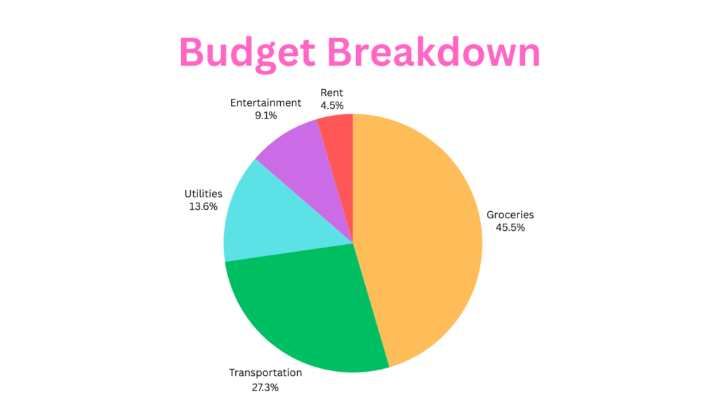
- Highlight Comparisons: Pie charts excel at showcasing how different categories compare in relation to the whole. They allow viewers to instantly identify which categories are the most dominant or the least. Take the example of our monthly budget, the pie chart will reveal if rent takes up a massive slice compared to groceries or if entertainment spending is a relatively small portion of your overall budget.
- Limited Data Sets: While pie charts can be powerful tools, it’s important to use them strategically. They are best suited for representing a limited number of data categories (usually 4-6 slices). If you have a vast amount of data with numerous categories, a pie chart can become cluttered and difficult to understand. Imagine trying to visualize ten or more slices in a pie chart – it would be like trying to fit too many toppings on a pizza.
Components of a Pie Chart
Understanding the components of a pie chart is crucial before learning how to make a pie chart. Here are the key elements:
- The Circle (Pie): The entire chart, represents 100% of the data set.
- Slices (Segments): Each slice represents a part of the whole. The size of the slice corresponds to its percentage of the total.
- Labels and Legends: Labels identify each slice, while legends provide the key to understanding what each color or pattern represents.
- Color Schemes: Colors help distinguish between different slices, making the chart easier to read.
How to Make a Pie Chart: Step-by-Step Guide
Ready to learn how to make a pie chart? Follow these seven simple steps to create a pie chart that impresses everyone.
- Step 1: Collecting Data
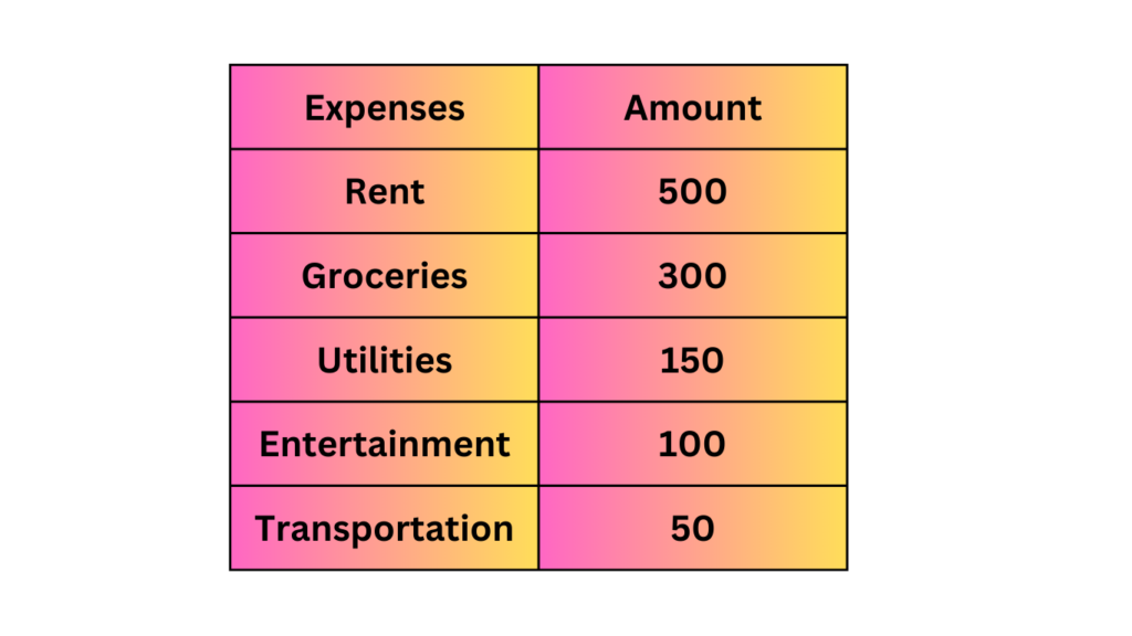
The first step in how to make a pie chart is collecting and organizing your data. Ensure your data is accurate and relevant to the point you’re trying to communicate. Data should be divided into categories that sum up to 100%. For example, if you want to visualize your budget breakdown then the first step is to collect all the data sets and categorize them in the following manner:

- Step 2: Calculating Percentages
Once you have your data, convert the raw numbers into percentages. This step is crucial in how to make a pie chart because the size of each slice will depend on these percentages.
Here’s a quick and easy way to calculate percentages:
- Add up all the values in your data set. For example, if the budget breakdown includes rent ($500), groceries ($300), utilities ($150), entertainment ($100), and transportation ($50), you would add all these values together (500 + 300 + 150 + 100 + 50 = $1100).
- Divide each individual value in your data set by the total sum. Let’s take rent as an example. Divide $500 (rent) by $1100 (total) and multiply the result by 100% to express it as a percentage (500 / 1100 * 100% = 45.45%). Repeat this process for each category in your data set.
- Step 3: Choosing the Right Tool
There are several tools available for creating pie charts. Here are some popular options:
- Microsoft Excel: A widely used tool for creating pie charts. Excel provides various customization options to make your chart look professional.
- Google Sheets: A free, web-based alternative to Excel that offers similar functionality.
- Online Tools: Websites like Canva and ChartGo offer user-friendly interfaces for creating pie charts.
- Specialized Software: Tools like Tableau and Adobe Illustrator provide advanced features for creating detailed and customized pie charts.
- Creating a Pie Chart by Hand: While less common in today’s digital age, you can still create a pie chart by hand. This method might require a bit more effort but can be a good option if you don’t have access to other tools. You’ll need a compass, a protractor, and a ruler to create accurate angles and slice sizes.
- Step 4: Creating the Pie Chart
Let’s dive into the practical steps of how to make a pie chart using a few of the popular tools mentioned:
Microsoft Excel:
- Enter your data into a spreadsheet.
- Select the data range.
- Go to the ‘Insert’ tab.
- Click on ‘Pie Chart’ and select the desired style.
- Customize the chart using the design and format tabs.
Google Sheets:
- Input your data into the cells.
- Highlight the data range.
- Click on ‘Insert’ in the menu.
- Choose ‘Chart’ and then select ‘Pie Chart.’
- Adjust the chart settings as needed.
Online Tools:
- Go to the website (e.g., Canva or ChartGo).
- Enter your data into the provided fields.
- Customize the chart’s appearance.
- Download or embed the chart as needed.
- Step 5: Adding Labels and Legends
A key aspect of how to make a pie chart is ensuring it is easy to read. Labels and legends are crucial for this. Labels should clearly indicate what each slice represents. Legends can be used to explain the colors or patterns used for each slice. Most tools allow you to add and customize these elements easily.
- Step 6: Styling and Customizing
Customization can make your pie chart stand out. Here are some tips on how to make a pie chart more engaging:
- Colors: Use contrasting colors for different slices to enhance readability.
- 3D Effects: Some tools allow you to add a 3D effect to your pie chart.
- Exploded Slices: Highlight a particular slice by pulling it out slightly from the rest of the pie.
- Fonts and Text: Use clear and legible fonts for labels and titles.
- Step 7: Interpreting and Presenting Your Pie Chart
Creating a pie chart is just the first step. You also need to know how to interpret and present it effectively. When presenting your pie chart, explain the data it represents and highlight key insights. Make sure your audience understands the significance of the proportions shown.
Here is the result of the example we had discussed on budget breakdown while going through how to make a pie chart:

Common Mistakes to Avoid
While learning how to make a pie chart, it’s essential to be aware of common mistakes:
- Overloading with Slices: Too many slices can make the chart hard to read. Aim for simplicity.
- Using Similar Colors: Distinguish slices with different, contrasting colors to avoid confusion.
- Misleading Data Representation: Ensure that the data accurately represents the proportions.
Conclusion
Pie charts are powerful tools for data visualization, providing a clear and engaging way to present information. By following this guide on how to make a pie chart, you can create charts that are not only accurate but also visually appealing. Whether you’re preparing a business report, a school project, or a research presentation, mastering how to make a pie chart will enhance your ability to communicate data effectively. So, go ahead and start creating stunning pie charts today.
We hope this comprehensive guide on how to make a pie chart has been helpful. If you have any questions or would like to share your pie chart experiences, please leave a comment below. For more tips and resources on data visualization, be sure to check out our related articles. Happy charting.
Frequently Asked Questions (FAQs)
What is a pie chart?
A pie chart is a circular graphic divided into slices to represent numerical proportions.
When should I use a pie chart?
Use a pie chart when you need to show parts of a whole or percentage distribution.
How to choose colors for my pie chart?
Use contrasting colors for different slices to enhance readability and visual appeal.
What are the best tools for creating pie charts?
Popular tools include Microsoft Excel, Google Sheets, Canva, and ChartGo.
How do I make my pie chart more engaging?
Customize your chart with clear labels, legends, and contrasting colors. Use 3D effects or exploded slices for emphasis.
Can I use a pie chart for complex data?
Pie charts are best for simple, proportional data. For complex data, consider using other chart types like bar charts or line graphs.
What are the alternatives to pie charts?
Alternatives include bar charts, line graphs, and scatter plots, depending on the data you want to present.
One Comment
Comments are closed.